

Our Redesign: Service Agreements
As the next step in our design overhaul, we are continuing to redefine and optimize the foundations of Previsto. In this post, we will present the upcoming new UI for Service agreements.
Software designs are never truly timeless. Even when it's clear that a product redesign is necessary, we often hesitate to undertake it. Throughout my career, I've been involved in several of these projects, and they've never been easy.
The challenges arise because there's never a perfect time for a redesign. It will always cause a new learning curve for all users, which can be a pain to handle in any busy workday.
Despite the difficulties, redesigns are essential. Without them, the user experience suffers. At Previsto, we have a strong focus on continuing to improve your workday by enhancing how Previsto can assist you in planning your work. Redesigning Service Agreements is a step further in that direction.
Issues with our current design
To illustrate why a redesign of service agreements are required, I would like to show some of the painpoints we have with our current design. It will explain why we have chosen to do a full redesign of one of the most used parts of Previsto. I will take a completely standard Service agreement as an example, and explain what the main issues are today.
Noise
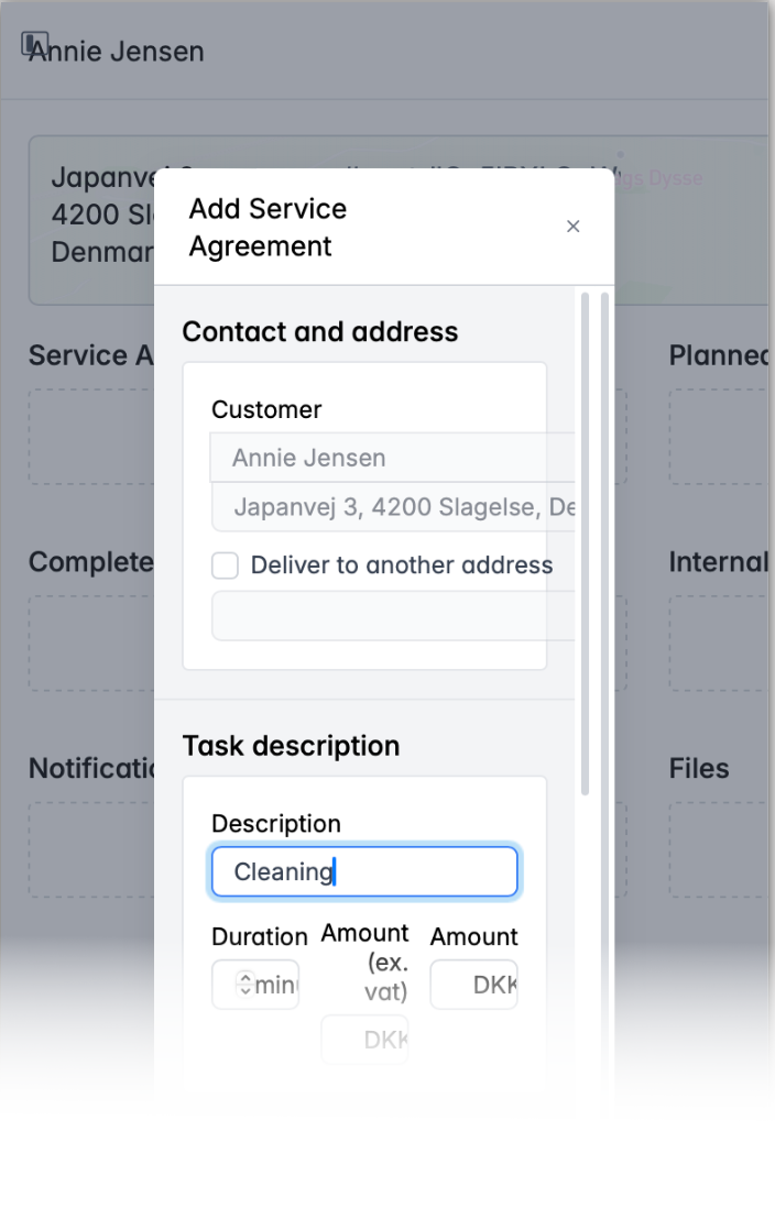
You may not have noticed it, but when you edit a service agreement, you're actually presented with a lot of visual noise that isn't necessary for you to see. Take a look at this example.
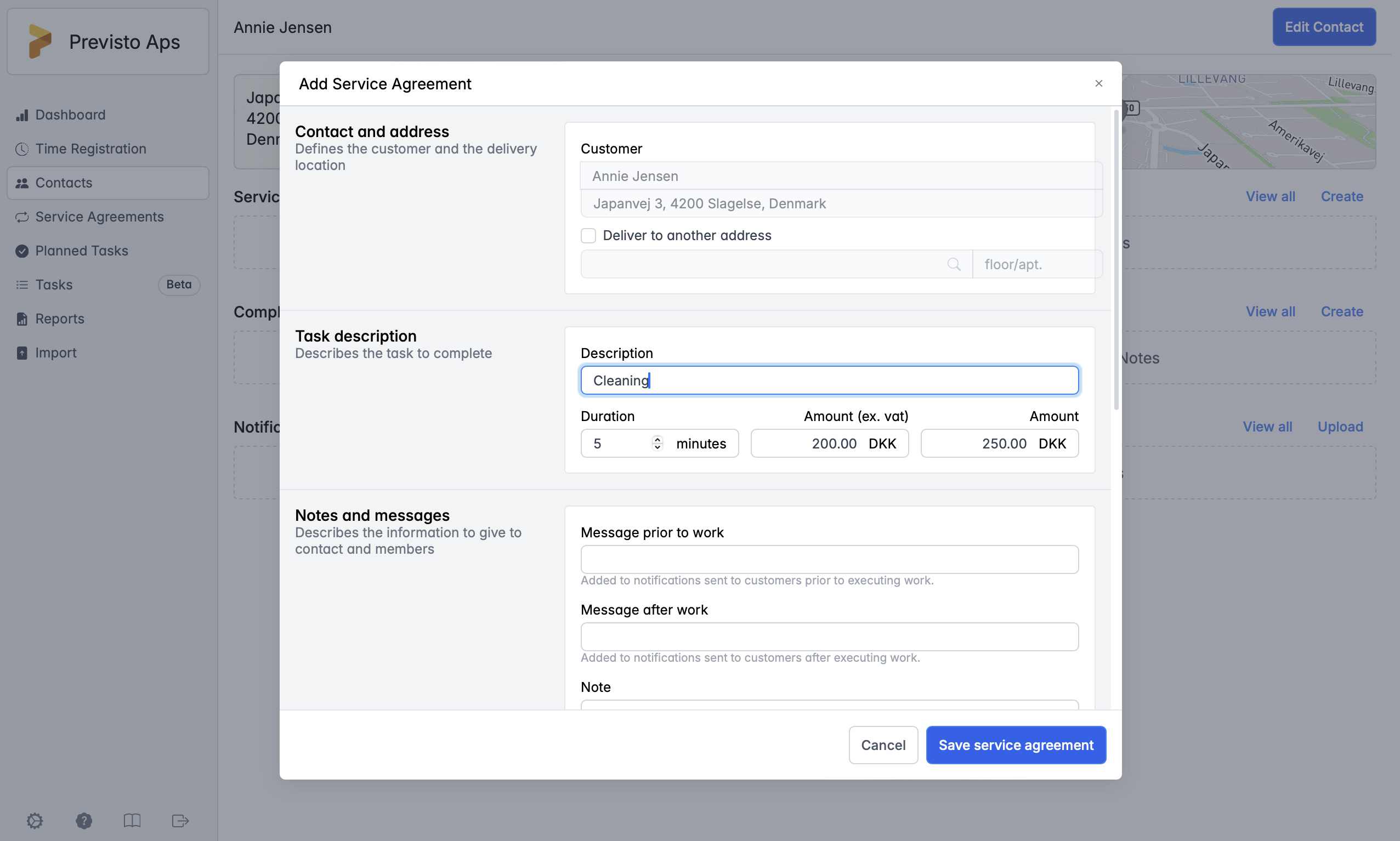 This is a dialog for editing a simple service agreement. All we have added is a short text of the service agreement and the amount for it. But notice what else draws focus in this image. In the background, you still see details about the contact, which are not needed right now. To the left of the editor, you are also presented with descriptions of all the form field sections, but you only need that information the first time you use the editor. It takes up a lot of screen estate and gives you too much visual noise.
Take a look at this image, which illustrates the visual noise by shading. 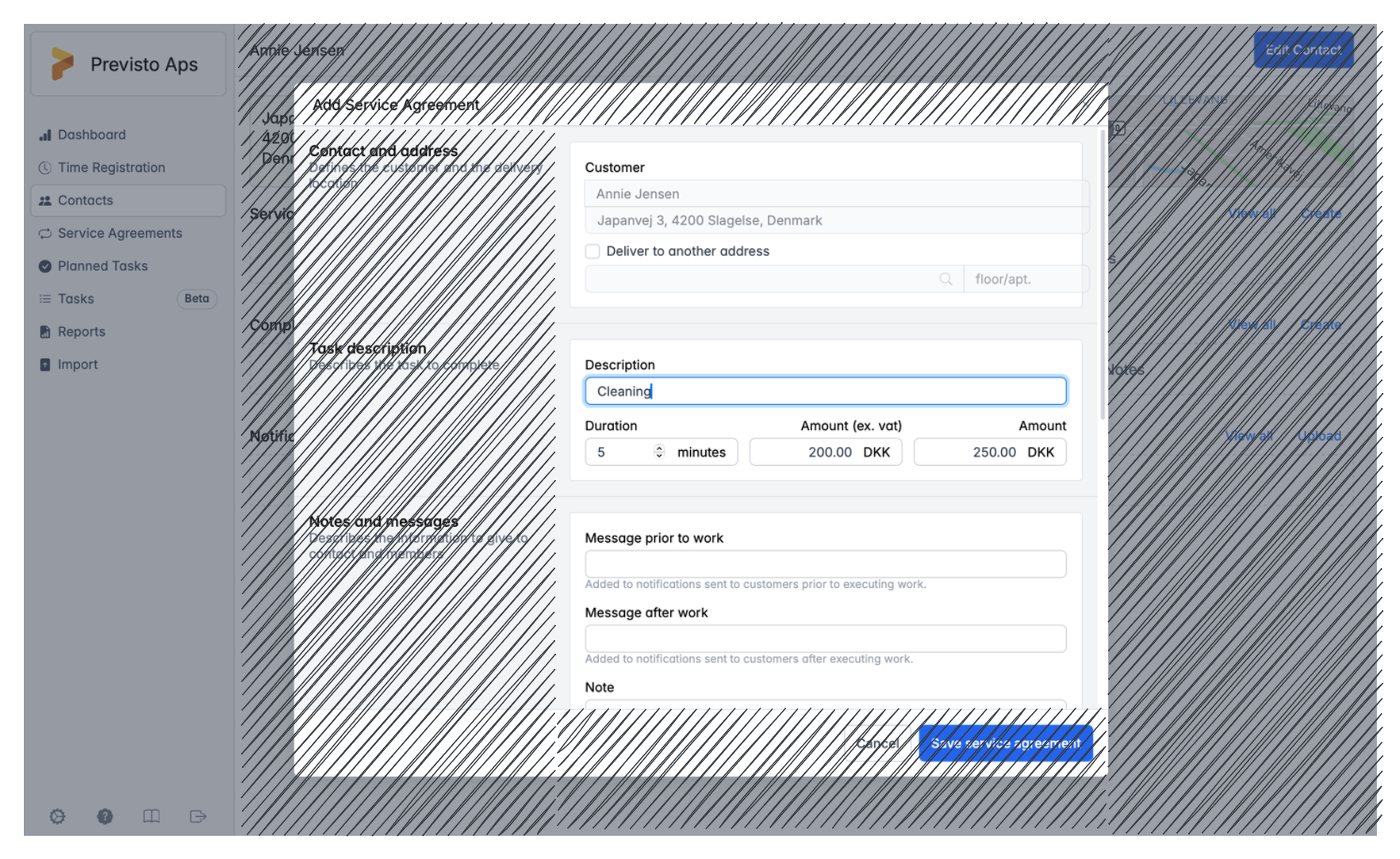
The available screen real estate for entering planning details is limited, even on larger screens. We aim to minimize visual clutter, allowing you to concentrate more effectively on the data you're editing.
Lack of overview
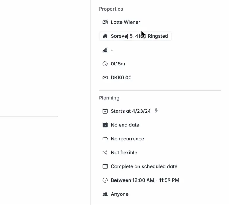
Another issue is the lack of overview of the entered data. This is partly related to the visual noise taking up a lot of real estate, but it's also tied to the way we present the editable fields. When we examine the same example as before, we also observe that we're only presented with half of the field for the service agreement. We need to scroll down to get a full overview.
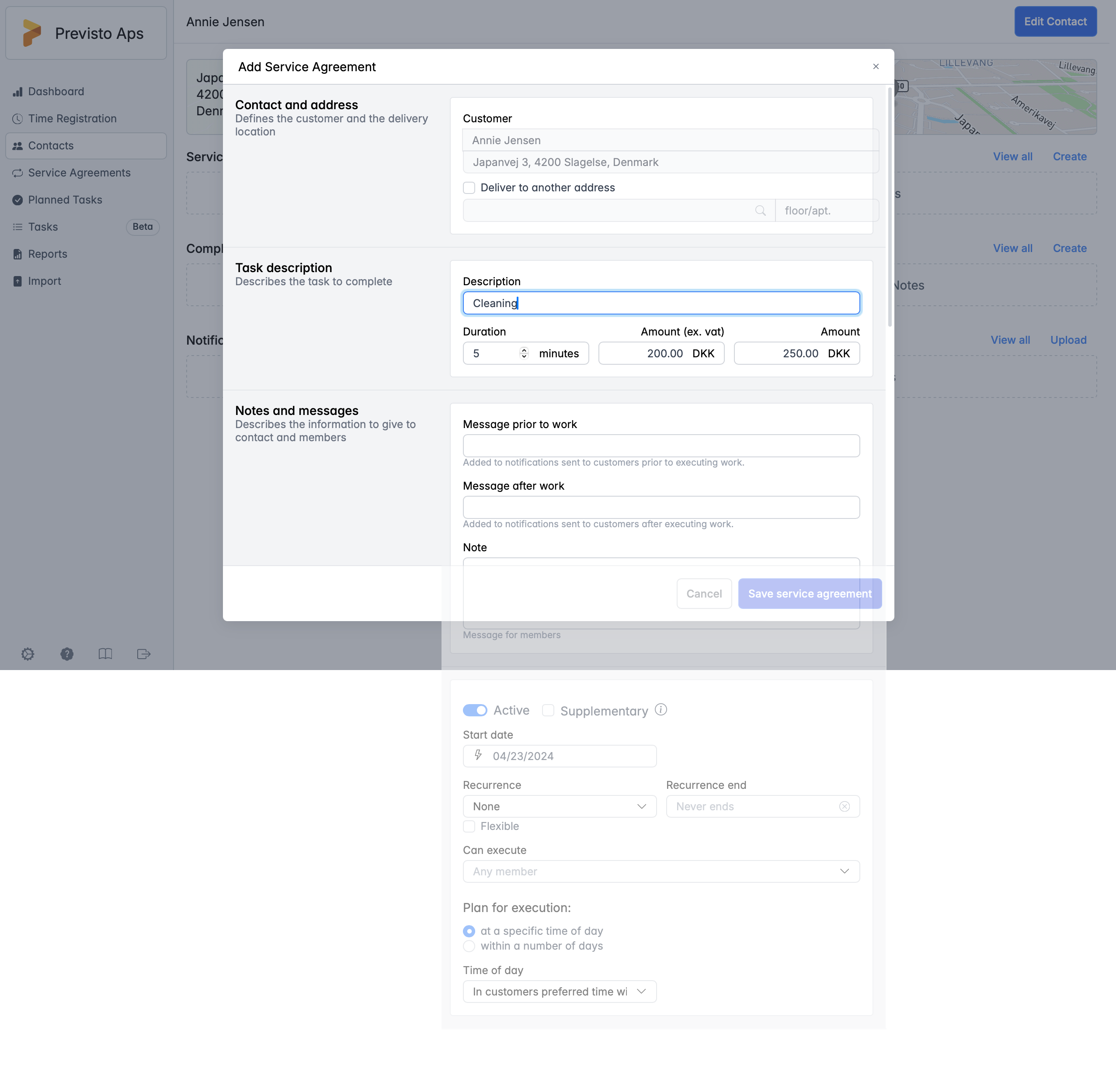
To view all editable fields simultaneously, the display needs to be extremely large with the current design. We aim to change that. By minimizing visual clutter and optimizing the layout of the editable fields, we can provide you with an overview of all the editable fields within the same view.
Not optimized for different display sizes
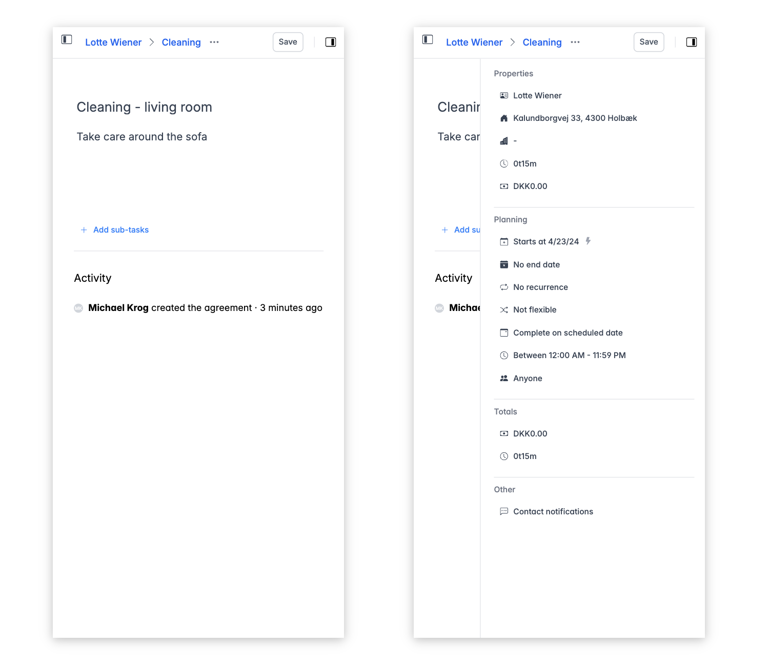
Furthermore, in connection with the visual noise and the absence of a comprehensive overview even on large displays, another significant issue arises: the editor is not optimized for smaller displays. Despite the simplified app we have for smartphones, we've observed that many users still desire the complete UI experience on small devices. Currently, Previsto's full web-based UI does not scale well to these devices, as the following image illustrates.
Our new upcoming design
To address the above issues, we have started a complete overhaul of the design of service agreements. We aim to:
- remove visual noise
- create a better overview
- support both small and large displays
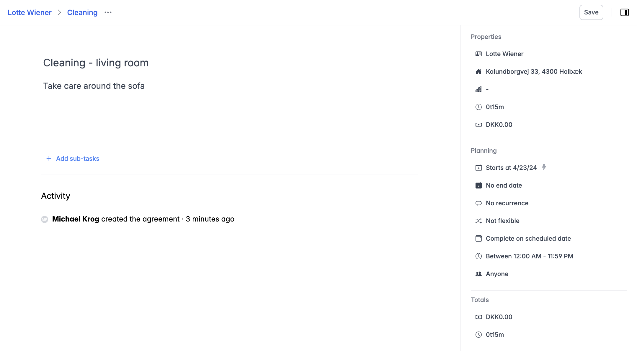
Focus on the most important data
After thorough consideration of the necessity for service agreements, comparing it to how the market generally employs service agreements, and discussing it with several Previsto users, the conclusion is that the most important data on a service agreement is its description.
What kind of task is to be performed? What description should the employee have? We have chosen to prioritize this information with the new design. 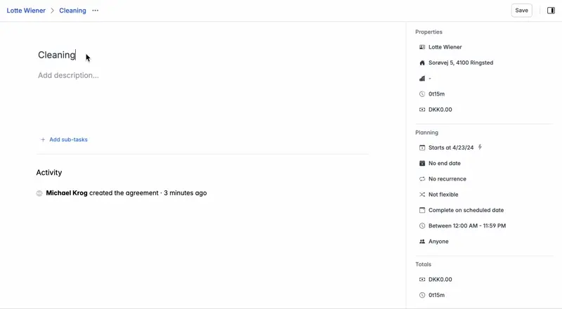
Notice the clarity? There is much less visual noise, and the focus is on the most important data—the task at hand and its description. You still have all your planning details to the right, and you have a full overview of all the editable fields within the same view.
Hide explanations under tooltips
In the new design, we have removed many explanations of different parts of the UI. We do this because you typically only need this information the first time you use the editor. However, we haven't entirely eliminated the explanations. Instead, we've tucked them away under tooltips, as shown in the following example.
Support for various display sizes
Another benefit of the new design is its scalability to various display sizes, from large screens to even the smallest ones on smartphones. The example below illustrates how the same editor appears on a smartphone, with and without the planning properties shown.
Coming soon to a display near you!
The new design we've presented here is nearly complete. We're adding some final touches to ensure the editor's high quality. Meanwhile, we're eager to receive your feedback on this new design. Let us know what you think on Twitter or LinkedIn or give our support direct feedback at support@previsto.com.