Beta-release of our new UI
We are very excited to announce the beta version of our new interface! We have been working hard for many months to further develop our product, and we are excited to share it with you now. We look forward to your feedback on its functionality and usability.
Super Simple
We have put a lot of effort into making the expression in Previsto's user interface as simple as possible. The color palette is made from scratch to ensure that you as a user get a calm image when you work with the system and the individual components are handmade from scratch in a beautiful design system. 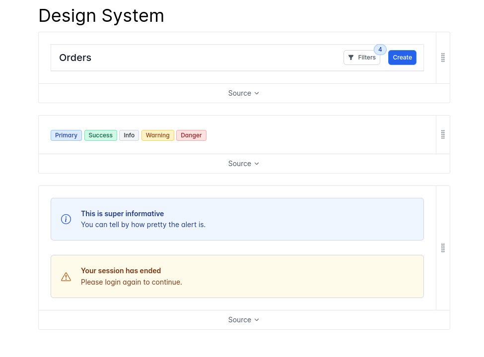
By using our design system to build the user interface, we ensure a uniform and beautiful user interface of high quality. 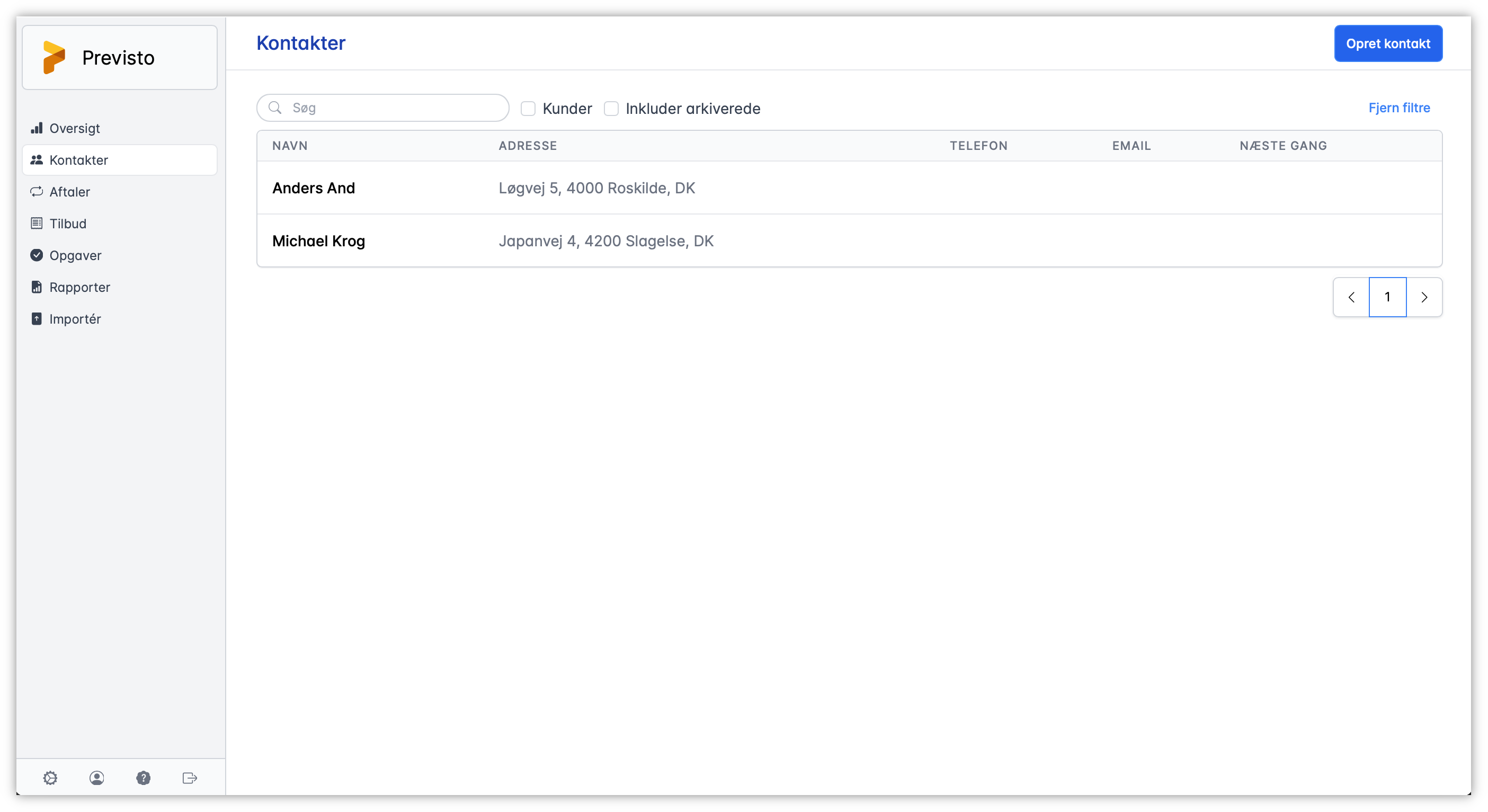
Overview of contacts
One of the points that has been emphasized several times is that it requires too many clicks to work with the system. This is especially true for the overview of a contact. There are tabs, there are menus and a lot of it seemed clunky or hidden.
In our new user interface, we have optimized the overview of a contact's information and made it easy to see all functions that can be accessed. Nothing is lumpy. Nothing is hidden. All information for the customer is at hand. 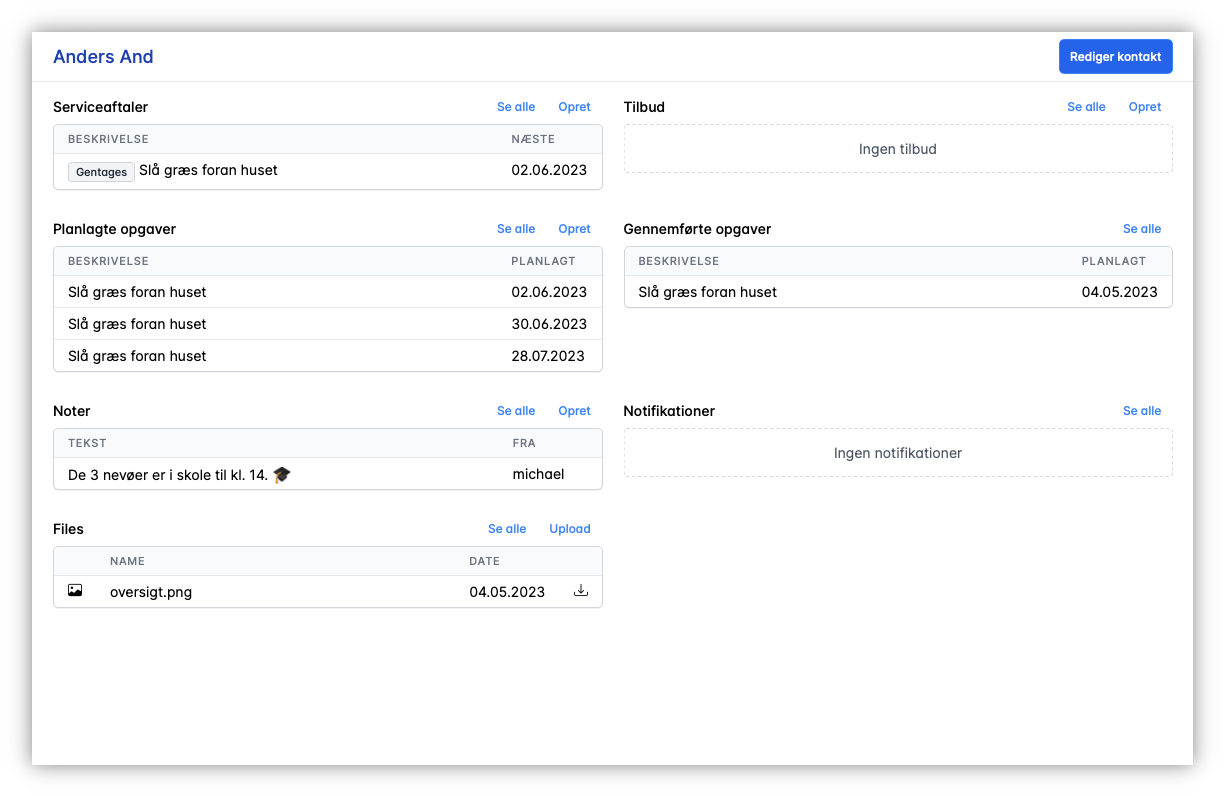
Agreements and quotes divided in two
Another point that has been highlighted is confusion around bidding in Previsto. Part of that is because offers and agreements are mixed up. In order to simplify both agreements and offers, we have therefore chosen to separate the 2 things in the new user interface. In the long term, it is our opinion to improve bidding in Previsto by creating a completely new and more flexible solution. 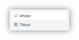
Editing of data
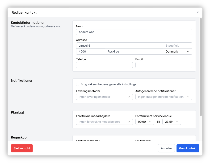
We have long felt that the various forms for editing data in the system needed an overhaul. Several of them were originally designed for use on both smartphones and computers, but a need had arisen to optimize them for screen sizes from tablet and larger.
After many iterations, we have decided on a design that will be used for editing both appointments, contacts and notes. Later, editing tasks will follow the same design. The new form design for editing data is much more self-explanatory than before.
Search
Finding your customers, agreements, tasks or other data is essential in a busy everyday life. It is therefore not surprising that we often get suggestions to expand the search in Previsto with more functions. We have listened to that and would like to present the new filters implemented in the new user interface.
All lists in Previsto will have a set of filters associated with them that can be used to search for data. In the example below, tasks are shown with filters to search for contact and status of the task. The filters can be combined as needed. And the individual lists have filters that match the data the list contains. 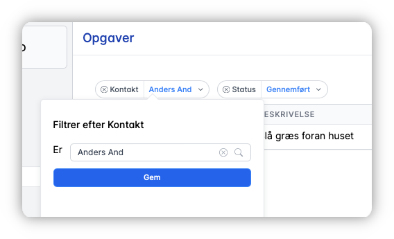
Security
An important element in building the new user interface is security. Already back in February, we introduced a completely new login system to Previsto. It was part of the construction of our new user interface and ensures that we no longer store users' passwords. It has also ensured that none of the users' passwords are insecure, as a new code is created and sent each time they log in.
We continue to optimize the security around the use of Previsto, but are also looking at more options to make the login procedure even simpler.
The coming future
With this beta release, we have started a new era for Previsto. You can expect that Previsto will become more and more easy to use at the same time as we expand the options it offers. There will be, among other things, more options for planning and communication with customers.
Join us for a new era with Previsto!

